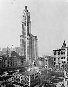
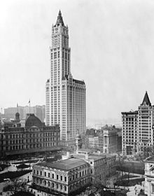
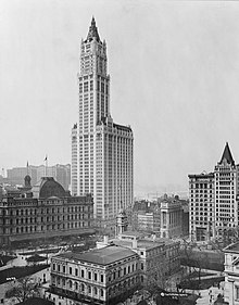
View of Woolworth Building and surrounding buildings Cleaned up, cropped and adjusted levels "Fixed" version
This image illustrates the Woolworth Building in New York City, which is of great historical importance and generally considered to be the first skyscraper. It was the tallest building in the world for 17 years, and almost a century later, it's still in the top 50 highest buildings in the US. The picture is striking: the streets are full of horses, and the building fits in architecturally with 19th century New York, but it just dwarfs everything else - truly the dawn of a new age. Take a look at the resolution and level of detail - it's stunning.
Conditional Support. The image page says that the picture uses a copyright tag that should no longer be used. If this is resolved, I will support. RyanGerbil1002:27, 21 March 2006 (UTC)[reply]
I tried to look into it, but I'm not sure if this image can be tagged with {{PD-old}}. It was copyrighted and published by a company c1913. Anyone know? ~MDD469603:05, 21 March 2006 (UTC)[reply]
Comment Pretty sure its copyrighted - Check out the library of congress legal page, the page the image is on says "NOTES: J178523 or 24 U.S. Copyright Office. Copyright by The Pictorial News Co., N.Y. " Though if that company is gone, does that mean its in the public domain?
Conditional Support. Very historic. Assuming the questions about copyright are resolved, I'll support it.Support the 2nd3rd version, but the original would be ok. --PS2pcGAMER (talk) 06:12, 21 March 2006 (UTC)[reply]
Comment I uploaded a version that I think looks better. I cleaned up the speckles (only in the sky), cropped it and adjusted the levels. I can do any combination of the three modifications, but I think the cleaned up sky, at least, is a must. I can't figure out how to make the new image's page look like the original's (PD tag, etc), so maybe someone can help me.--Zambaretzu09:58, 21 March 2006 (UTC)[reply]
It's definitely not leaning any more than the original - the fact that the leaning black frame was cropped out might give that impression. As for being washed out, I thought the original was too dark, especially in the lower left; I can upload a darker edit if that's the consensus though.--Zambaretzu06:19, 24 March 2006 (UTC)[reply]
Support "fixed" version. Selective brightening of LL corner, rotated 0.3 deg. CV, border cropped out, smudges in sky removed, slight sharpening. --Janke | Talk07:26, 24 March 2006 (UTC)[reply]
Support although I'm not sure which is better. The second one looks too washed out to me. I think the original is better as an image of an artifact and the third one is better as a picture. It's a great illustration of how the financial district used to look (and one of my favorite buildings). Makemi22:53, 24 March 2006 (UTC)[reply]